
The Bigfork FUSION design process

Design is the second part of our FUSION process. This is the exciting part where everything starts coming together.
Why have a design process?
In the olden days, a new website project would start with a home page before anything else. It was a hangover from print design where you’d produce visuals for a pitch. This became problematic and with hindsight it’s easy to see why. The designer had to come up with a style, copy, layout, images, and structure all at once. There was no research beyond the client brief. Getting it wrong could mean starting over, which delayed projects and increased costs.
This is why we developed our FUSION process. It’s the result of years of experience, careful thinking, and learning from our mistakes. Our process delivers better B2B websites, and this article will explain how.
When does design start?
The design phase comes after discovery. But design is considered from the very start. For example, our briefing document includes questions about websites you like. The discovery workshop covers your brand. This all feeds into the website specification and the spec includes all our findings, such as:
- information about your brand
- positioning and messaging
- website structure and content plan
- competitor analysis
- accessible design requirements
- customer profiles
- websites that you do and don’t like
This is everything we need to write the design brief. Which is an internal document that bridges the gap between specification and design. It’s written by yours truly, as design director, and briefed to a designer. The designer will also review the full specification, so they have the full picture.
Setting the mood
The first stage of design is to develop mood boards. There’s rarely one correct design for a new website, and these allow us to explore options.
The aim of the mood boards is to give an idea of how the website could look, without being a full design. Though we usually present mood boards to look like a website, it’s easier to imagine the real thing. The best way to explain it is to show some examples.
Our mood boards will:
- Show fonts and how they’ll be used
- Demonstrate colours and combinations
- Include example layouts and design features
- Suggest an image or photography style
They won’t:
- Reflect the website content or structure.
- Show navigation
- Be interactive
Get the copy right (and the images)
Design isn't just pictures.
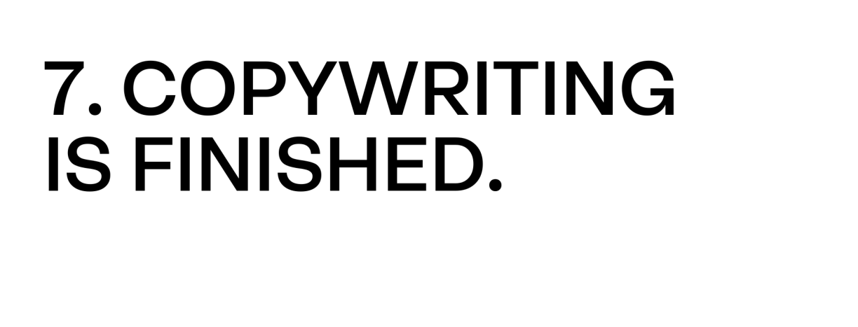
Words make a huge difference to a website. What’s the point in a flashy design if the content sends people to sleep and is riddled with errors?
Using the content plan from the specification, we already know what needs writing. And we'd advise having your new website written by a professional (we can help with this).
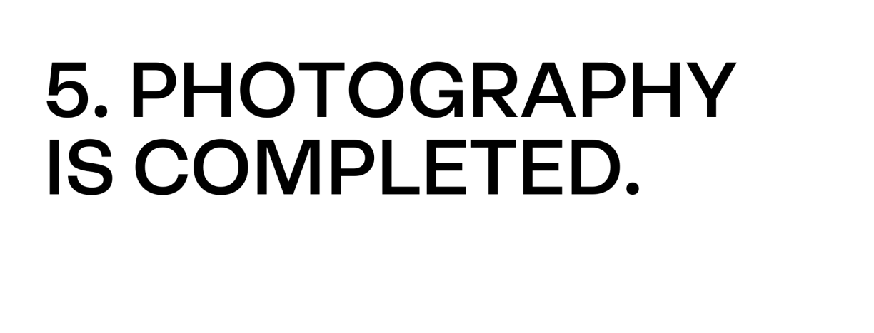
Much like copy, the quality of your photos and videos is mega important.
Again, we always recommend hiring a professional photographer. If your budget is limited, you can buy high-quality images from stock libraries. But never try to take snaps on your phone; low-quality images will ruin your new website.
A note on timings
In an ideal world, we would write all the copy before starting the mood boards. Then the mood boards can define the style for photography. And photos would be taken before the website page design starts.
But waiting for each step makes projects take longer. So, to keep things moving, we work to a critical path where everything overlaps, and often looks like this:
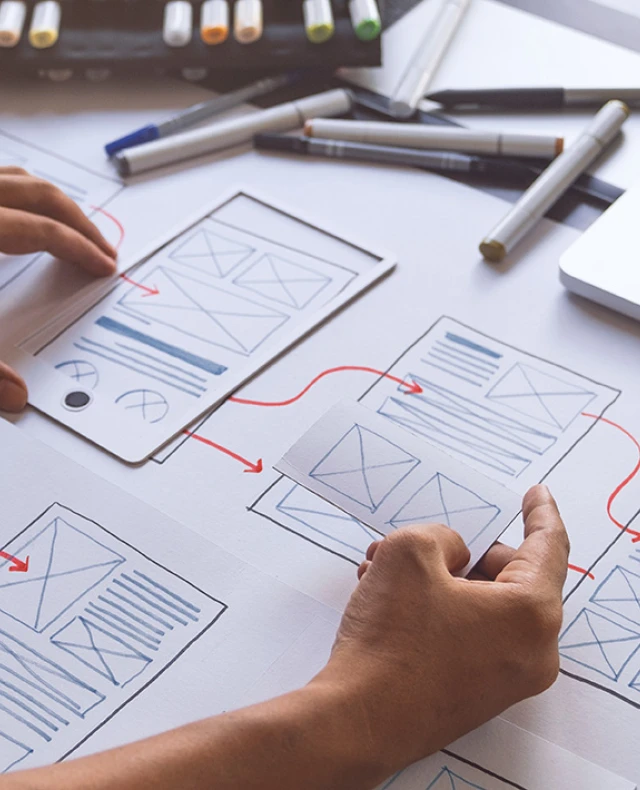
Is it wireframes or wire frames?
For websites, it’s wireframes. So now you know. Designers use wireframes to visualise page structures without any creative. They can be sketches in a notepad or created on screen.
We often start wireframes during the content plan. So now they need fleshing out. For most projects, we won’t present wireframes to you. Unless there’s complex functionality to discuss, nobody wants to see a load of grey boxes.
They’re to help us think about how content is going to work and the design elements we need to create. We create wireframes for all the main website pages. And show how each will work on mobile and desktop.
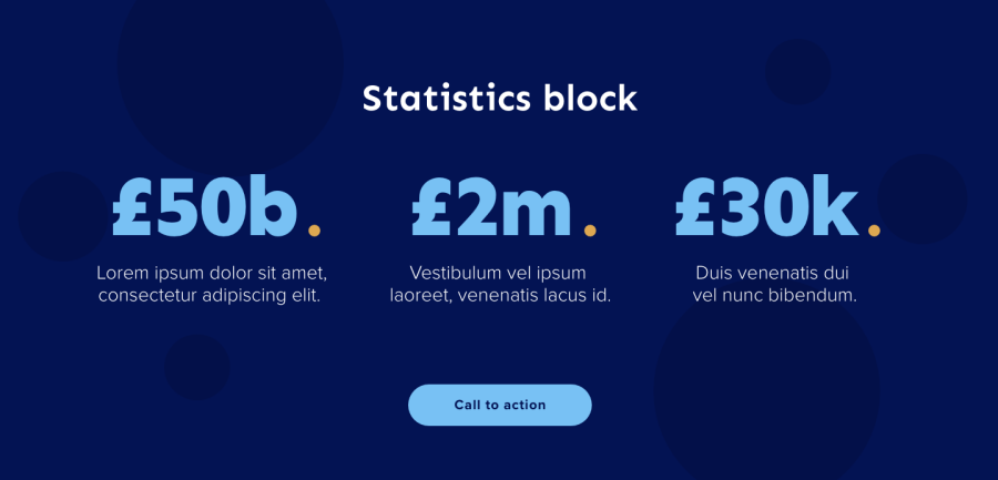
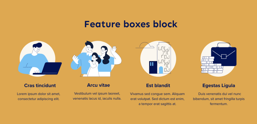
Modern websites are not usually created from fixed templates. Instead, they use “content blocks” that allow building pages from reusable elements. A bit like website Lego®. Examples of content blocks are:
- Hero image / video
- Text area
- Columned content
- Feature boxes
- Gallery
- Product listing
This list isn’t exhaustive, and every website we create is different. Wireframes help us visualise content and define the content blocks your website needs.
It also ensures that no content gets left out. It’s a lot easier to add a missing button to a sketch than to a finished home page.
You may have heard the term "low-fidelity prototype”. That’s when we show how wireframes interact with each other. It’s useful for testing the website early on, including customer journeys.
This is where we do our first internal testing:
- Do the journeys make sense?
- Are the layouts working?
- Is there much or too little content on any pages?
- Should we add / change any content blocks?
Home is where the art is
To recap, so far we have:
- Discovery docs (including spec)
- Copy
- Mood boards
- Photos / videos
- Wireframes
And that’s everything we need to start on the “high-fidelity”, aka proper designs.
With all the information available, there’s no guesswork required. The designer can focus on making everything look great. And more importantly make it work brilliantly.
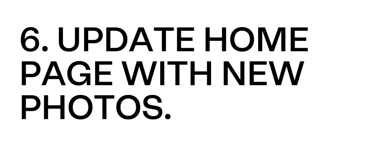
To start with, we’ll only design the home page. For desktop and mobile. The designs will often have interactive elements like button roll-overs and hover menus.
More complex effects such as scroll interactions wouldn’t be shown. For these we provide reference websites so you can see how they’ll work. And we’ll present the design to you so we can explain the details.
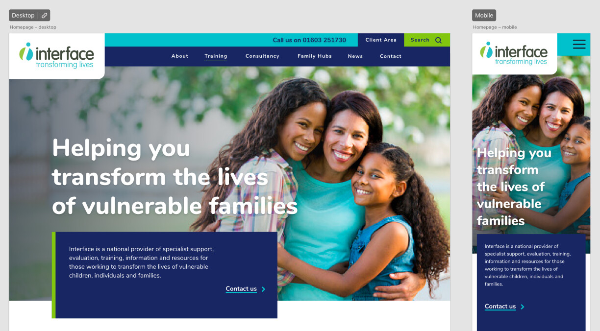
Example home page design.
Before we present the home page, we test it internally. When we show it to you, we’ll ask for structured feedback:
- Does this meet the brief?
- Are the designs on brand?
- Is it clear who you are and what you do?
- Are there clear paths for users to follow?
- Does the content work?
Because of our process, the answers are nearly always “yes”. We expect some minor amends but that’s also part of the process.
The reason for this feedback structure is to keep the end goal in mind. And avoids comments such as “my spouse doesn’t like purple” (this actually happened). Amusing anecdote aside:
- Their spouse was not the target audience
- Purple was on brand
Remember, your website is for your customers. Not for you, or the board, or your significant other.
Designing the rest of the website
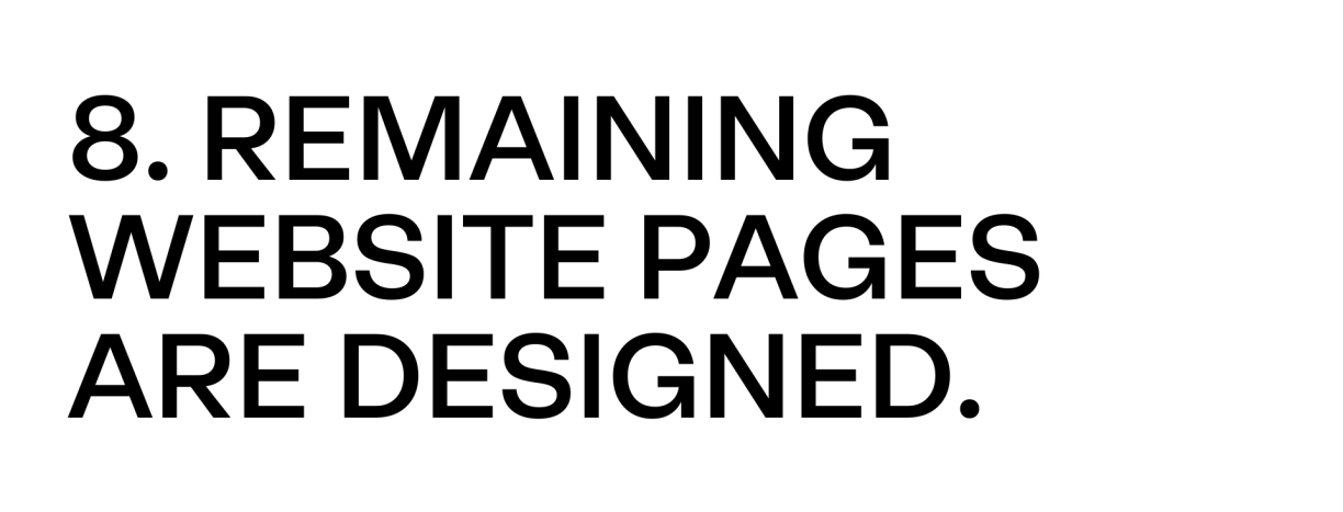
Once everyone is happy with the home page designs, we’ll start work on other key pages. By key pages we mean the pages with unique elements, or combinations of elements. This makes sure we have designed all the content blocks the website will need. There’s no need to design every single page. A lot of pages will reuse layouts, so will be created during development.
From these pages, we create a content block library. Some agencies might make the library first. But we do it this way because going library-first ended up restricting designs. Our aim is always to deliver a great design, without worrying about limitations.
Using our library, we’ll check some other pages to be sure we have all the blocks we need. Once we’re sure all is well, we’ll present the final designs to you. Again, for desktop and mobile. And as before, we ask for structured feedback.
Prototypes, testing, and purple feedback
Depending on the size of the project, and whether we’re doing user testing, we may set the designs up as a prototype.
In normal words, this just means making all the links work. You can click around pages and interact with buttons and menus. Like a real website, but not quite. For example, it won’t be responsive. So won’t scale with your browser window or be optimised for mobile. And as above, no scroll effects.
If user testing is part of the project, this is where the first round comes in. There’s an argument for testing during wireframes. But for typical websites, we find this the most useful place for it.
For user testing we prefer one-to-one tests over surveys. The tests take place via a video call and involve carrying out tasks. For example, imagine we’re testing a trade-only cutlery vendor. The tasks we set might be:
- You’re looking for spoons on the website, how would you go about finding them
- You’ve a question about a product, what would you do?
The tasks are based on the goals set out in discovery. They’re specific by design. We want to know if people can carry them out, and how long it takes. Or in UX terms, evaluating the effectiveness and efficiency.
Watching and listening to people navigate the website prototype shows us this. It can also lead to other feedback that might be useful. Just be careful about comments on the use of purple.
The final furlong
We expect there’ll be some amends from feedback and testing. It’s best to address these in one go. That way, the next draft will show all the updates at once.
Some people like to provide amendments in a document, others prefer to discuss on a call. If there’s a lot of people that need to sign the website off, make sure they have their input. Once development starts, changing things becomes harder and costs more.
We allow for 1-2 rounds of amends. Once these are complete, the designs are ready. You have an amazing new website ready to be built. And because we followed our process, everything ran smoothly with no surprises. You’re happy, we’re happy, and your website will do the business.
It just needs one more thing, you to sign it off. Once that’s done, it’s time for the next phase of FUSION – development.

If you'd like to learn more about our FUSION process, or speak to us about your website, feel free to get in touch.
This article was updated on , filed under website design.
Get the latest B2B website news straight to your inbox

Ready
to get
started?
We can make your new website a great success.