Calls-to-action and why your B2B website needs them
Your B2B website might be sleek, professional, and filled with valuable content, but if it's not driving your visitors to take action, you're leaving a lot on the table. 'Calls-To-Action' or CTAs, form an essential part of an effective marketing strategy.
What does a call-to-action mean on a B2B website?
Every time you visit a website and you're prompted to “Sign up”, “Contact Us”, “Buy Now”, or other similar nudges, you're interacting with a CTA. A CTA is like the definitive signage on your web highway guiding visitors towards a desired destination.
In the B2B context, a CTA encourages potential customers to take the next step in the buyer's journey. This could be requesting a quote, scheduling a demo, or even starting a free trial. The paths are varied, but the ultimate goal is conversion — turning a website visitor into a potential lead, and becoming a happy customer.
Why are call-to-actions important?
CTAs are the bridge connecting your funnel and potential customers. They might seem like just a few words or a button, but trust us, they carry a significant load of importance!
The B2B buying cycle can be quite long, requiring 3 or 4 decision-makers to study and evaluate their options carefully before taking the (financial) plunge, whereas with B2C it is a much faster purchase journey. Your B2B CTA can serve as a helpful guide, gently encouraging prospects towards making an informed decision, rather than pushing for a hasty purchase.
Better yet, effective CTAs can not only boost conversions but also serve as essential tools for gathering audience insights. By tracking CTA clicks, you gain comprehensive data on visitor interests, helping you to refine your content strategy and focus on what truly works.

How to write a good call-to-action?
Writing a stellar CTA isn't rocket science, but it does require thoughtfulness. Here's how to go about it:
Use precision: Be clear and concise about what you want your visitor to do. "Download our Guide" is far more effective than "Click Here".
Create urgency: Encourage immediate action. Phrases like "Limited Offer" or "Book a Demo Today" can make a difference.
Get personal: Adding a little bit of the human touch and personalisation can go a long way with B2B, it’s not just for the realms of B2C, so try switching from "Start Free Trial" or “Sign Up” to "Start My Free Trial" or “Get Me Signed Up”.
Speak to value: Highlight the value proposition. Instead of "Sign Up", try "Get Your Personalised report."
How many calls-to-action should you have on a landing page?
When it comes to the number of CTAs on a single landing page, remember - less is often more. A common rule of thumb is to have one primary CTA per page. This singular focus helps to guide visitors towards your intended conversion path without distracting them with multiple choices.
That said, depending on the length and content of your landing page, multiple CTAs might work, especially if they're leading to the same end action. What’s most important is to ensure they are strategically placed and do not overwhelm the visitor.
Some examples of great B2B CTAs
Trello
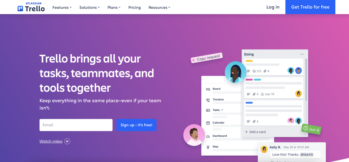
Trello, a visual collaboration tool for planning and organising projects, does a great job featuring its primary CTA by slightly tweaking the standard "Sign up for free" to “Sign up – it’s free!”, making it feel more friendly and approachable.

MailChimp
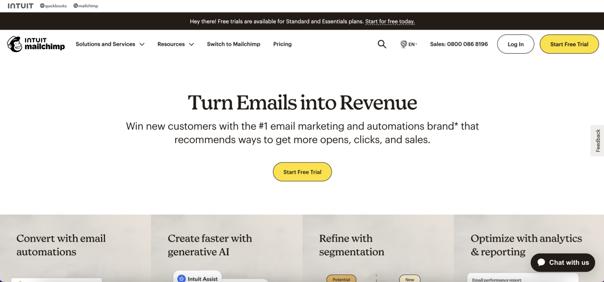
MailChimp, an all-in-one integrated marketing platform, showcases effective usage of CTAs. The primary button, "Sign Up Free", is a bold yellow that stands out from the monochrome colour palette used on the rest of the page, ensuring visitors won’t miss it.

FreshBooks
FreshBooks, an accounting software for small businesses, highlights a solid CTA on its homepage - "Buy Now & Save". This CTA is displayed to make visitors aware of the ongoing discounted offer. It merges the concept of making a purchase with saving money, which may prompt business owners to make a faster decision.

CTAs are more than just buttons or bits of text on your B2B website - they're your golden tickets to conversion. They guide visitors through their purchasing journey, spark interaction, and ultimately deliver value from their visit. They can be the difference between a good website and a great one. So why wait? Start inspecting your website today, sprinkle in some enticing and thoughtful CTAs, and prepare to witness the transformation of your visitors into promising leads.
This article was published on , filed under website content, website design.
The Forkcast
Not your average B2B newsletter. Spice up your inbox with The Forkcast.

